1. Photo Analysis through Adobe Bridge:
The Moor - Building Remnant - Photo 2
This photo shows the age of the building and the fact that the area below it used to be a building and the marks left on it give it a different identity to it's current one. It clearly shows that there was another building attached to it and it used to have another purpose.
The photograph is a landscape/wide shot which displays the entirety of the building. A shallow depth of field was used as there are no other focus apart from the subject itself i.e. the building. The Aperture size was 8.0 because at the time of taking the photograph, there was a rather large cloud blocking some of the light in the area. To compensate for the high aperture, the shutter speed was set at a average-high shutter speed (1/160th) to prevent overexposure. The main focus of the photo is from the centre of the photograph displaying all the features of the building, both are in balance as it shows the current building and the marking of old building. There are several shapes from when the building used to be on that area and it distinctly shows what it was. An example of it could be the shape on the left hand side which may show what may have been a set of stairs it is very apparent that it is almost surreal. I have framed the photo to show the 2 different sides of the building: The building remnant and the current standing building. Both are main focuses of the photograph as it displays the age of both the buildings. Both can be considered old but the one that was taken down is clearly more aged. The photo was taken from a low angle as to enforce the effect that the building had a strong presence in its area.

Blonk Street - Two Sides - Photo 25
The two sides of the building displays two different designs: one shows a more flat form of design (On the right) whereas the one on the left shows a dynamic form of design with the different shades and coloured bricks.
The area I took the photograph in was rather dark as I was underneath another building, taking the photograph. The building I was stood under also blocked some of the light facing towards the side of the building I was taking a photograph of. This was a almost-close up shot as I tried to find an angle that displayed both sides of the building and I had to get quite close to it. The aperture size was 5.0 as there was not enough light at the time. However it did balance out the light reflecting from the windows. It connotes the sense of time, when the sun passes over from one side to another, it shows 2 different perspectives for the two sides; one side will see the light first before the other but both have different aspects of time. The shutter speed was 1/60th of a second because as aforementioned, there was not enough light. However, it did produce an effect of a blue to white gradient on the left side building. I framed the photo using the building itself. The two are split by a bar in the centre which further connotes the transition from one time to another. The ISO was set at 125 to compensate for the low aperture and the slow shutter speed to prevent it from being overexposed.

Blonk Street - Continous - Photo 26
The photo displays a light gradient from light to dark. This is very apparent as the light passes through the across the building rather evenly. Quite a dynamic photo because of the gradual lighting and the brick colours.
The shutter speed was 1/60th because it had to detect as much as possible and it was done to create the gradient lighting. The aperture was set at 5.0 because of the amount of light there was at the time. This photo had one or two obstructions so I took the photo from a rather close shot and a low angle. This was to add more to 'gradual' effect. The lighting reflects the state of the buildings windows and it applies to its identity of time. The windows at the bottom are more likely to have their windows open because they are likely to want more light compared to those who are in the light already and they prefer having slightly less light. The framing is done with the lines that seem to connect the building sides together which creates an allusion of different sets of building.
Castle Gate - Mirror - Photo 11
The photo displays the age through its brickwork underneath each of the windows. The photo shows the wall may originally not have windows and had them added, which means the building had a different purpose until it was changed to have windows. What may have been unviewable before from inside the building is now clearly shown. This is a connotation of progress in some way.
The photograph was taken with a larger aperture size and average-fast shutter speed as the area was quite exposed to light and the windows would have reflected too much light if I had a slower shutter speed. The details of the window, both the brickworks holding it up and the reflection of the sky are both captured well because of the fast shutter speed. The photo has a deep depth of field because it focuses on the greater details of the building and it was able to capture the reflection of the sky on the windows; this is to create an allusion of the original architects of the building wanting to reach farther into the sky but the inability of our technology disallowed them from doing so. This is further connoted because of the fact that I have framed the building to create the effect that building is constantly growing upwards. This photo was taken from a low angle to connote the common style of buildings being built towards the sky consistently.
Castle Gate - Reform - Photo 14
The building was originally an older building but has had improvements to its building work. However, a section is left untouched and features the buildings original state which create a contrast and in turn, create the its identity of time.
This photo has an average sized aperture because a rather large cloud had covered most of the sunlight at the time of taking the photograph but the reflection of sky did appear on the windows of the building. The photo is quite sharp which means it has a deep depth of field and it also helps the rules of third because it shows the old part of the building rather clearly and it goes along two focal points which means people who look at the photo will most likely get drawn towards the top of the photo. This photograph was taken with an eye-line angle to create a canvas for a photo to be edited on top of it as a foreground. The lighting at the time of taking the photograph was slightly dim so the aperture size as set to 5.6 to capture as much light as possible whilst still preventing it from taking too much in. Whilst doing so, it captured a very flat lighting on the building which helps define its age and brick colouration.
Arundel Gate - Travel - Photo 7
Over time, travel has become a part of everyday life. The building shows its age and in turn shows how long it has been a necessity. The angle the photo was taken with and lighting help to define the aging.
I took the photograph with quite a fast shutter speed with a 7.1 aperture size to capture a flat lighting of where I was stood from. I did this because if I had a gradual lighting from anywhere, it would mean that people who are looking at the photograph will be more drawn towards that instead of looking at certain focal points around the edges and towards the centre. The rule of thirds has been distributed so that the main focal points are directly on the small corner of the building side and towards the small aged vent on the top right corner. Each of these features displays age in some way and I made it more distinguished.
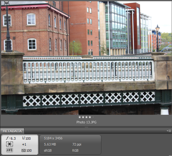
Lady's Bridge - Connection - Photo 13
A man made connection between two points. This form of architecture was made so that people can travel across with ease. Used both as a road and as a path, it shows it's age through its brick works. The bridge is framed between the two small pillar like features the bridge has.
The photo was taken with a 1/100th shutter speed, with an aperture size of 6.3 and with an ISO Value of 100. This was due to the lightning being sufficient for the type of shot I was taking. I framed the bridge with the small pillar like features to make sure the main focus of the photograph was the bridge and the way it has aged. I have considered what I will be using in the photo and it will most likely just the bridge and leaving out the background.
Lady's Bridge Area (Blonk Street) - Set Link - Photo 21
Another man made feature the same as above but with a different style. This bridge displays far more history than that of the Lady's Bridge due to the fact that the bricks are more apparent. I took the photo in consideration of what I am going to be editing it with and took the photo to make it appear like it is missing the rest of the bridge.
I took the photo with a 1/60th shutter speed and with an aperture size of 5.6 to compensate for how much light there was present. The slow shutter speed was used so that it would take a reflection of the water more vibrantly as it will add to the effect when the photo is edited together with the other bridge photograph. The main reason I took this photo was for the editing process in which I will create an almost seamless transition from this bridge to the other, to connote the meaning of time changing the style of architecture.
Lady's Bridge Area - Modern Mirror - Photo 19
A modern building with a certain style of design. The way the windows have been designed seemingly create a image that both room on each side of the buildings are one whole room. The style that has been done to create this building reflect the sense of the type of architecture people are designing in the present time.
This photo was taken with a fast shutter speed of 1/100th and with an aperture size of 7.1 because of the amount of the light being reflected off the windows. Another reason for taking the photo with these settings is to create a gradual lighting effect from left to right. A wide shot is used to capture as much the building as possible without compromising the quality of the lighting. This is photo is good for creating a double exposure effect bu putting it on another building with a different style/design to create a contrast between the two architectures.